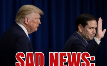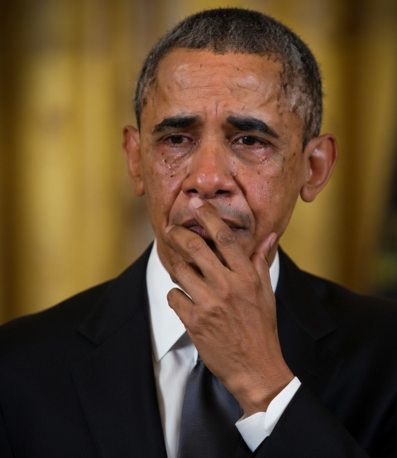
The Obama Presidential Center in Chicago is currently weathering a storm of criticism following the release of updated renderings and details regarding its architectural execution. While the Obama Foundation intended for these new visuals to build anticipation for the completed project, the reaction from residents and experts has been largely skeptical. The primary point of contention involves a massive new inscription on the museum tower, which features an excerpt from former President Barack Obama’s 2015 speech in Selma, Alabama, delivered to commemorate the 50th anniversary of the civil rights marches.
Prominent critics have labeled the text nearly unreadable due to its wrapping layout and font style. Lee Bay, the architecture critic for the Chicago Sun-Times, remarked on LinkedIn that the inscription gives off “lorem ipsum vibes,” suggesting it looks more like placeholder text than a legible tribute. Meanwhile, author John LeFevre and Temple University Professor Jacob Shell pointed out technical flaws in the typography, noting that characters like “E,” “F,” “T,” and “L” are virtually indistinguishable from one another. Shell described the effort to read the script as “headache-inducing,” while LeFevre offered a harsher critique of the overall structure’s silhouette, comparing it to a trash can. This latest backlash highlights ongoing tensions surrounding the center’s aesthetic and its integration into the local landscape. Despite the Obama Foundation’s efforts to showcase the center’s surrounding green spaces and exterior design, the “disjointed” nature of the commemorative text remains a focal point for those who believe the design lacks functional clarity. From social media influencers like Johnny Maga to academic experts, the consensus suggests that the landmark’s latest design update has missed the mark for many observers.